Build A Low-Lift BI Dashboard with Supermetrics, Google Sheets, and Looker Studio
Written by: Gabe Solberg Read time 14 minutes
Have you ever struggled to get a clear, unified view of your cross-channel marketing performance in a simple-to-use dashboard? With data scattered across various platforms, creating a comprehensive dashboard can feel like an impossible task. Yet, having a centralized dashboard is crucial for understanding your performance and making data-driven decisions that can significantly impact your business outcomes.
In this series of posts, we’ll dive into different dashboard builds, starting with the foundational data architecture and automation flows. By the end of this guide, you’ll have a 28-day cross-channel trends dashboard, complete with controls to measure, analyze, and optimize data trends across Google Ads, Microsoft Ads (Bing), and Meta.
In this tutorial, we will build two specific dashboard views, but don’t feel limited by these examples. Once your foundational data table is set up, you’ll have endless possibilities for visualization and additional channels.
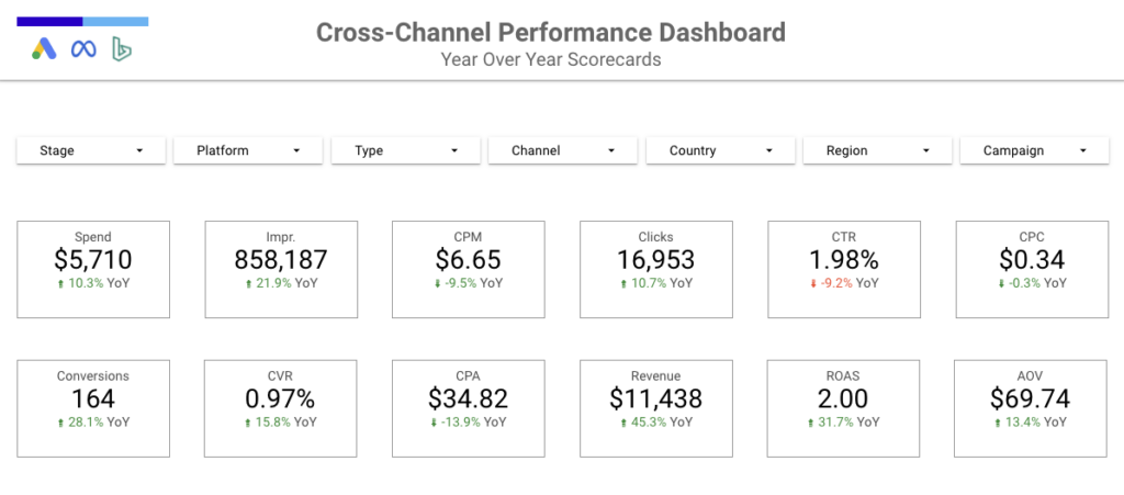
Here’s a preview of a cross-channel year-over-year scorecard view with custom filter controls:
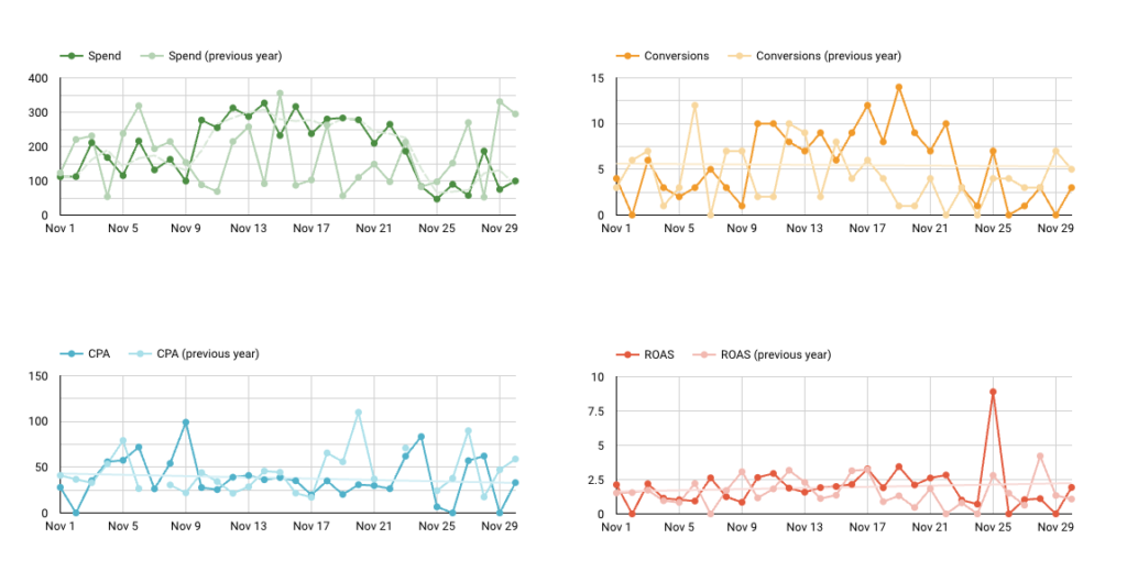
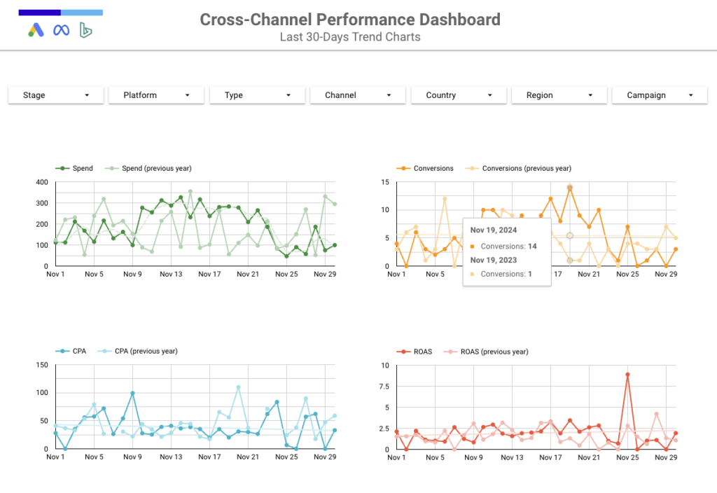
And here is a preview of a last 30 days time series trend with a year-over-year overlay:

Let’s get started on building a DIY Data Warehouse using Google Sheets and Looker Studio!
Required Tools – Supermetrics, Google Sheets, Looker Studio
We’re going to use a low-lift approach to unify data across multiple platforms without needing any data science or engineering support. The result will be a solid tool to measure cross-channel performance and impress clients.
To achieve this, we’ll use the following tools:
Google Sheets: This is where your final data table that connects to Looker Studio will live.
Supermetrics: This tool will help us pull data from different sources into Google Sheets.
Looker Studio: A free Google product that we’ll use to build our reporting dashboard.
Dashboard Resources:
You can reference and make a copy of this Looker Studio Template. Additionally, here is the Google Sheet containing the demo platform data. You can copy this sheet to see the formulas and connect it to your own Looker Studio report as a data source.
Ad Platform Naming Conventions
The ad account structure and campaign naming convention are key to making this work properly. Let’s break down the identifiers that we need to include in our campaign naming conventions so that we can parse out values to organize our data.
These are the core pieces of information we need:
Stage – Awareness, Consideration, Decision, Brand, Non-Brand
Platform – Meta, Google Ads, Microsoft Ads, DV360
Type – ASC, Performance Max, Search, YouTube, Standard
Channel – Paid Search, Paid Social, Display, Video
Country – United States, Canada
Region – North America
Campaign – Evergreen, New Launch
It is important to keep the order of each variable consistent we will explain why when we get to our Google Sheets formulas. Here are some example campaign names:
Decision_Meta_ASC_Paid-Social_United-States_North-Amercia_Evergreen_Analytics-Experts
The more information you need to include the longer the campaign name will get so you might want to create a key for each value to shorten the campaign name.
In addition, this format is easily legible in UTM Parameters and even though there is no PII data included it is better to code each variable so that it is not easily legible when translated into UTMs
Here is what a coded campaign name looks like:
DESC_META_ASC_PSI_US_NA_EG
We can also include additional pieces of information after the core variable. For example:
Audience
Here is what a coded campaign name looks like
DESC_META_ASC_PSI_US_NA_EG_Analytics-Experts
Writing Business Logic In Google Sheets
We are going to use a mix of Google Sheets formulas, including ARRAYFORMULAs, and nested IF statements using REGEXMATCH, to parse our final data set. This approach allows us to categorize our data with dimension fields that can be used in dashboard segmentation and filtering.

If you’re not an advanced Google Sheets user, don’t worry! I will provide each formula here with a breakdown of how it works, along with nuances to consider in the formula logic.
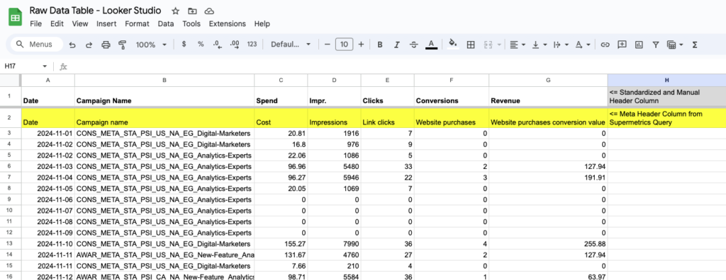
Platform Data Tables – The Date Campaign Table
In this example, we are going to unify Meta Ads, Google Ads, and Microsoft Ads into one data table to report on channel, platform, stage, and campaign data over time. Let’s get started building your data campaign table.
Data Table Metrics
We are only going to pull raw data into the Google Sheet, so we do not need to include any calculated metrics such as conversion rate or cost per purchase. We will create custom fields for these metrics within Looker Studio.
The raw metrics we will include are:
- Cost
- Impressions
- Clicks
- Conversions – Purchases
- Conversion Value – Revenue
Setting Up Data Table Dimensions You Can Filter In Your Dashboard
One key consideration is how each platform breaks down dimensions. Meta, Google, and Bing are consistent; however, with DV360, you need to add conversion types as a dimension breakdown so that we can create a purchase conversion column that matches the other platforms. This results in DV360 having an additional column in our data table, but we need to keep our columns consistent when we combine all data sets into the final data table.
Add visual
To ensure we have the same column set across each platform, we need to add a filler column to Meta, Google, and Bing. We can do this by adding the account name.
Defining Required Header Columns In Your Data Table
Since each platform uses its own header columns, we need to create standardized naming for all header columns. We can create these manually and make them work best for us. We are going to use the following header columns:
- Date
- Campaign Name
- Spend
- Impr.
- Clicks
- Conversions
- Revenue
Here is an example of how Supermetrics pulls in header columns for Meta:
Here is how they are defined in Google Ads:

And here is how they are defined for Microsoft Ads (Bing):

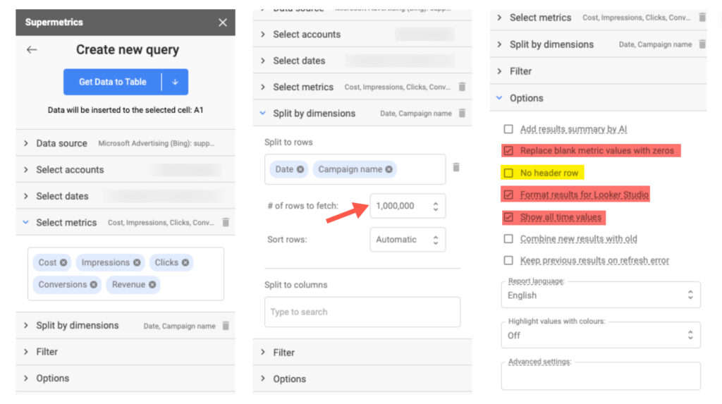
Because we are going to set our header columns manually, they will stay consistent. First, we pull in the platform data with the header columns included to verify that we are pulling the correct data.
Once the columns have been verified, go back and modify your query. Under options, select “No header row.”

Setting Up The Dashboard The Data Table – Creating Tabs for Each Platform In Google Sheets
For this example, we are going to pull data from three sources:
- Meta
- Google Ads
- Microsoft Ads (Bing)
We will create one tab for each platform and use the same manually defined header columns for each tab, as we defined in the previous step for consistency.
Let’s go ahead and create one tab for each platform, naming them as follows:
- Meta – Raw Data
- Google Ads – Raw Data
- Microsoft Ads (Bing) – Raw Data
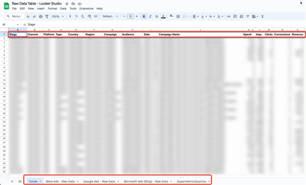
Now, add one more tab called ‘Totals’ with the same header names. This tab is where we will combine the data across all data sources.
Note: You can only have 1 million cells per spreadsheet, so it’s important to remove any unused columns to avoid maxing out your spreadsheet size.
Creating Supermetrics Queries In Google Sheets
Supermetrics is pretty intuitive to use. I won’t walk through every step, but I’ll include screenshots of each query below that you can reference:
Meta Ads Supermetrics Query
Important: Ensure that Disable unified attribution settings is disabled otherwise you might not see any conversion and revenue data.
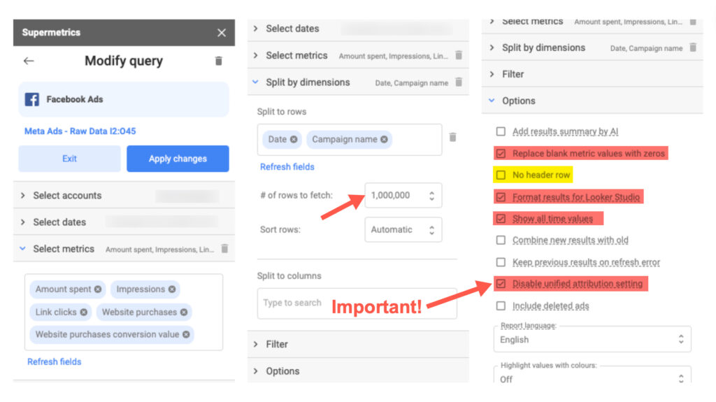
Google Ads Supermetrics Query

Microsoft Ads (Bing) Supermetrics Query
Adding Conversion Columns To Google Sheets
We are going to pull in the primary conversion for each ad platform. My next post will speak to pulling in multiple conversions to understand the conversion makeup across products and to build funnel reporting.
Google and Microsoft Ads
For Google and Bing, we are going to pull in the conversions column. The conversions column will only count conversions that are assigned at the campaign level. If campaigns are using Account Level Conversions, it will include all conversions that are defined as Primary Conversions in Google Ads.
Meta Ads
Since we are working with a traditional purchase funnel, we are going to use the Website Purchase conversion event as our primary conversion.
Date Range Lookback Window
Since seasonality plays a variable in performance year over year, it’s a more accurate representation of performance trends when compared to period-over-period data. If you have enough historical data, I would recommend that you go with a 1-year lookback as the start date for your Supermetrics queries. This way, we can pull in YoY trendlines and percent changes into the scorecards.
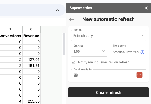
Setting The Update Frequency In Supermetrics
Once you have all the queries added to your sheet, let’s go ahead and create a daily schedule for updates. Note that you would need to upgrade to the Supermetrics for Google Sheets Core plan to allow for daily refreshes. I like to set the Start at for Daily Refreshes to early in the morninig so that my data is updated when I get online.
Aggregating Platform Tables In Google Sheets
Now that we have all of our data organized and cleaned up with a daily refresh scheduled, we can go ahead and build our final data table that will connect to Looker Data Studio.
First, we need to create a new tab and call it “Totals” (Google Sheet for Reference) The name of the tab is optional, so feel free to label it whatever you want. Next, we need to copy our column headers over. For this step, it is important that all column headers are consistent across all tabs.
Now, we are going to yse the UNIQUE function. This will aggregate and deduplicate all rows across all tabs. The end result is one cross-channel data table that we can now connect to Google Data Studio.

=UNIQUE({'Meta Ads - Raw Data'!A3:G; 'Google Ads - Raw Data'!A3:G; 'Microsoft Ads (Bing) - Raw Data'!A3:G})Adding Business Logic In Google Sheets
Now, let’s add business logic to create a data architecture that we can use to segment and filter our data in the live dashboard.
We are going to add the following additional dimensions as column headers to the Totals tab.
- Stage
- Channel
- Platform
- Type
- Country
- Region
- Campaign
- Audience
You can add as many dimensions as needed, provided your naming conventions remain consistent across platforms. Setting up dimensions involves the same steps for each. I’ll demonstrate specific examples for Stage, Platform, and Channel that you can replicate as needed below.
Stage Dashboard Dimension
For the stage, we need to parse out each stage in the campaign name. To do this, we will use the IFS function in conjunction with the REGEX function to look for a condition that matches. Keep in mind that the IFS function returns a value that corresponds to the first true condition. We will nest the IFS function in an ARRAYFORMULA so that it auto-populates down all rows.
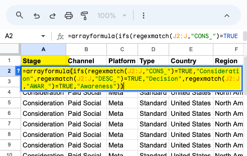
=arrayformula(ifs(regexmatch(J2:J,"CONS_")=TRUE,"Consideration",regexmatch(J2:J,"DESC_")=TRUE,"Decision",regexmatch(J2:J,"AWAR_")=TRUE,"Awareness"))Platform Dashboard Dimension
For the platform, we will use the same functions as we did for the stage.
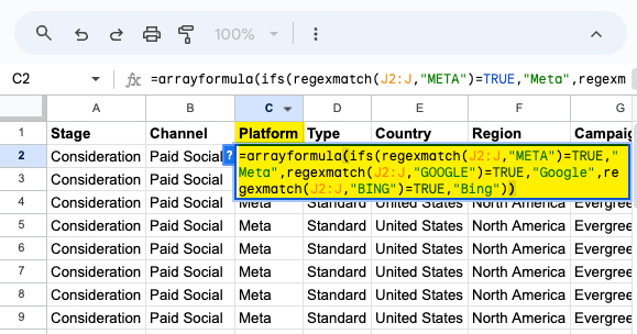
=arrayformula(ifs(regexmatch(J2:J,"META")=TRUE,"Meta",regexmatch(J2:J,"GOOGLE")=TRUE,"Google",regexmatch(J2:J,"BING")=TRUE,"Bing"))Channel Dashboard Dimension
For the channel and platform, we can use a static string of text since they are unique to each tab. However, we do want them to automatically populate to the last row as Supermetrics daily refresh adds new rows. To do this, we will nest a simple IF statement that returns the same value for TRUE and FALSE into an array formula.

=arrayformula(ifs(regexmatch(J2:J,"PSI")=TRUE,"Paid Social",regexmatch(J2:J,"PSC")=TRUE,"Paid Search"))Building Your Dashboard In Looker Studio
Lets head over to Looker Data Studio and create a new report.

Adding Tables As Data Sources In Looker Studio
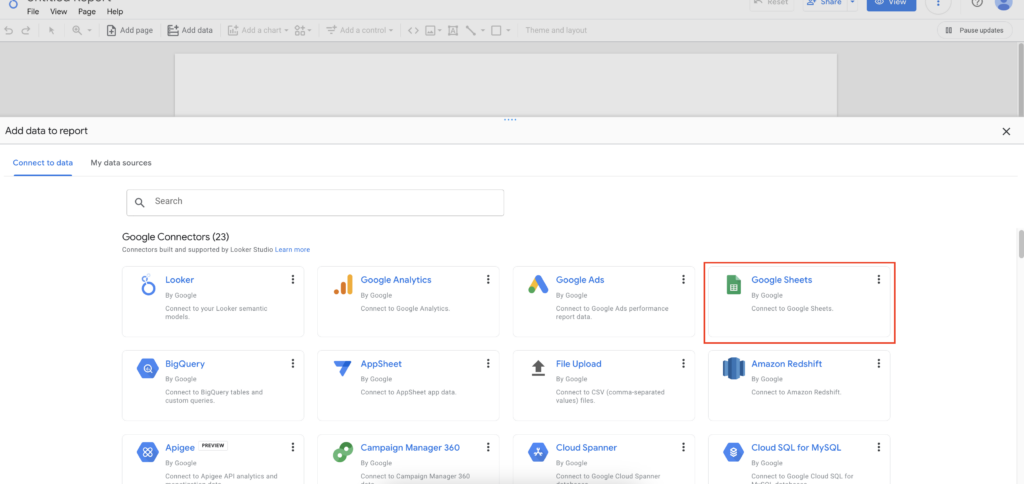
Add data to the report by selecting Google Sheets as the data source.
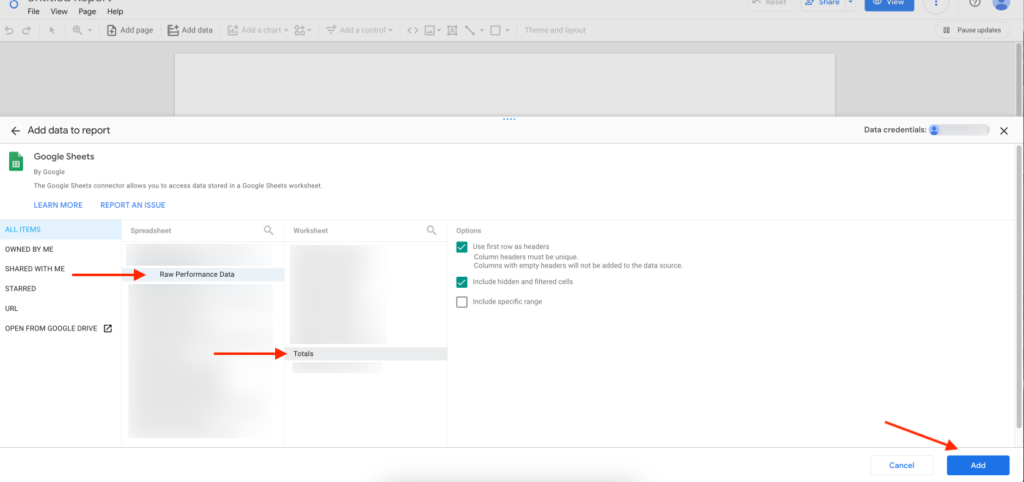
Choose the Google Sheet you created and select the Totals tab, then click Add in the bottom right.
Creating Custom Data Source Fields In Looker Studio
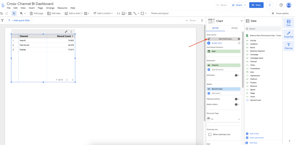
Now that we have our raw data table connected we will want to build out all of our required metrics on the data source level. If you create them on the Chart level they will only be available for said chart.
After adding your Google Sheets data source, select the default table in your report and click on the pencil icon under Data source.
Create the following calculated fields:
- CTR (Click Through Rate)
- CPC (Cost Per Click)
- CVR (Conversion Rate)
- CPA (Cost Per Action)
- ROAS (Return on Ad Spend)
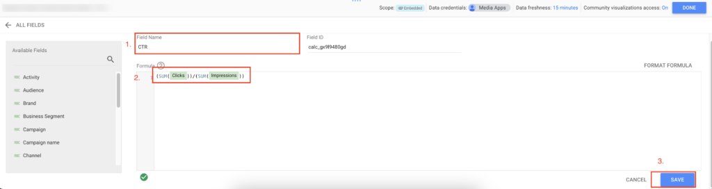
To create a calculate field click on ADD A FIELD
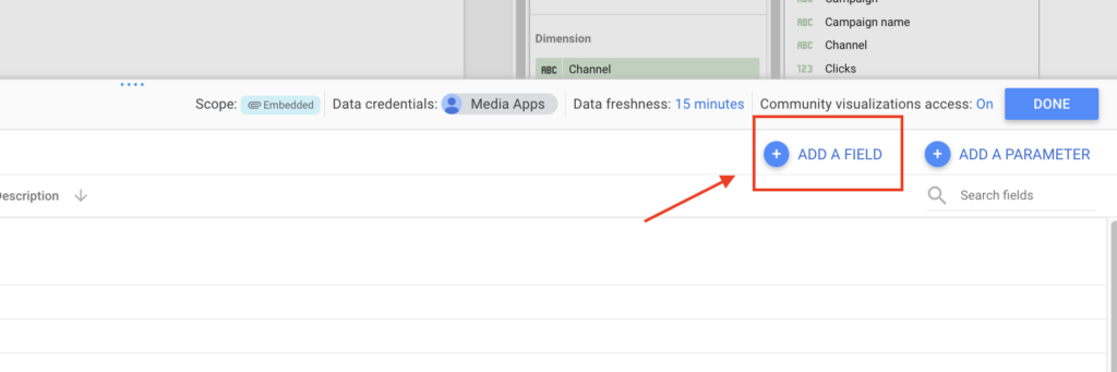
Then select Add calculated field
I will walk you through the creation of the first field then go ahead and create the remaining fields.
- First give the Calculated Field a name.
- Next enter the formula to calculate the filed
- Then click save
You can copy and paste the formulas for each as long as you are using the same column headers we specified earlier in the post. If not will need to replace the field names in the calculations to match your column headers. For example if instead of Spend you are using Cost you would need to replace all Spend values below with Cost.
CTR = (sum(Clicks))/(sum(Impressions))
CPC = (sum(Spend))/(sum(Clicks))
CVR = (sum(Conversions))/(sum(Clicks))
CPA = (sum(spend))/(sum(Conversions))
ROAS = (sum(Revenue))/(sum(Spend))
Next we are going to review all fields to ensure they are set to the right type. Date should be Date Spend and Revenue should be set to currency and so forth.

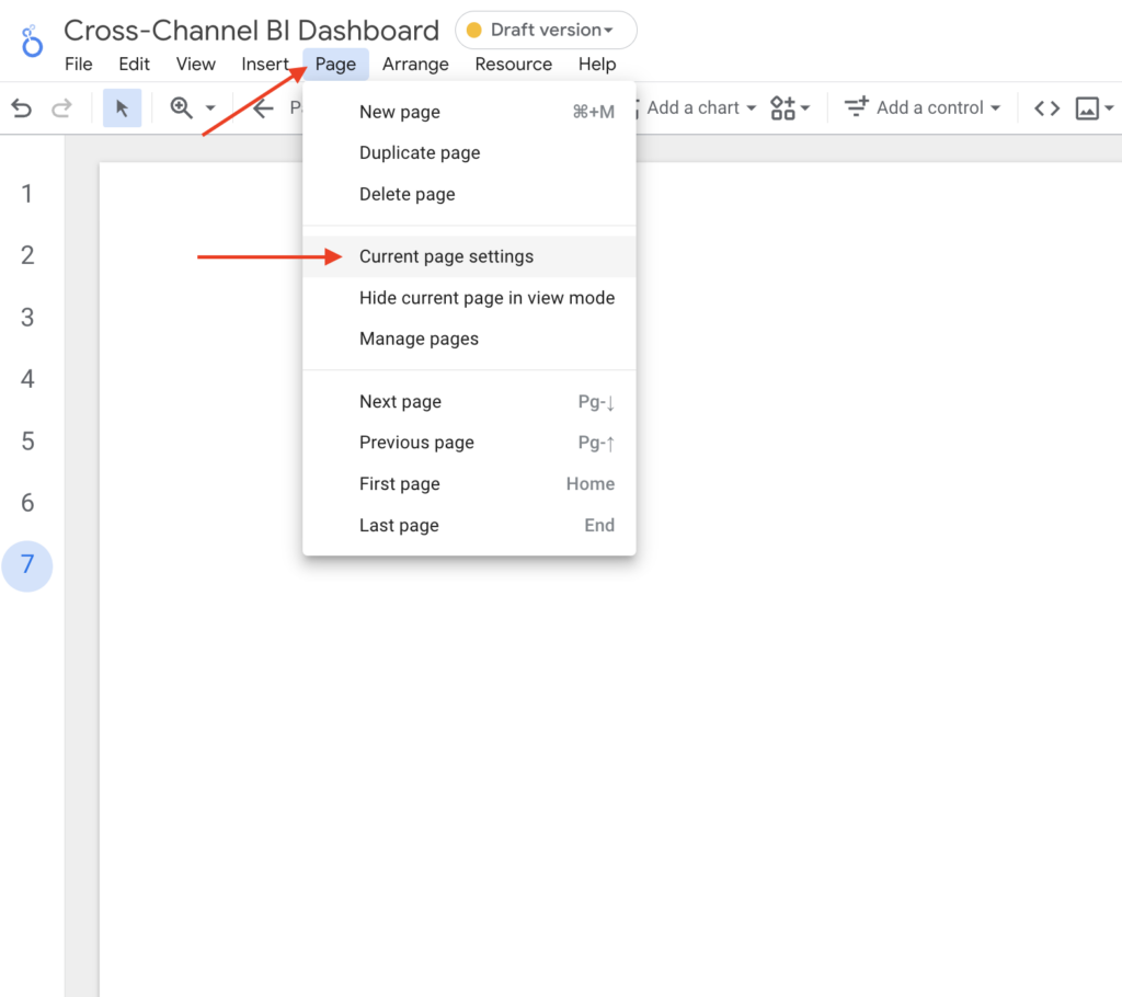
Looker Studio Page Settings
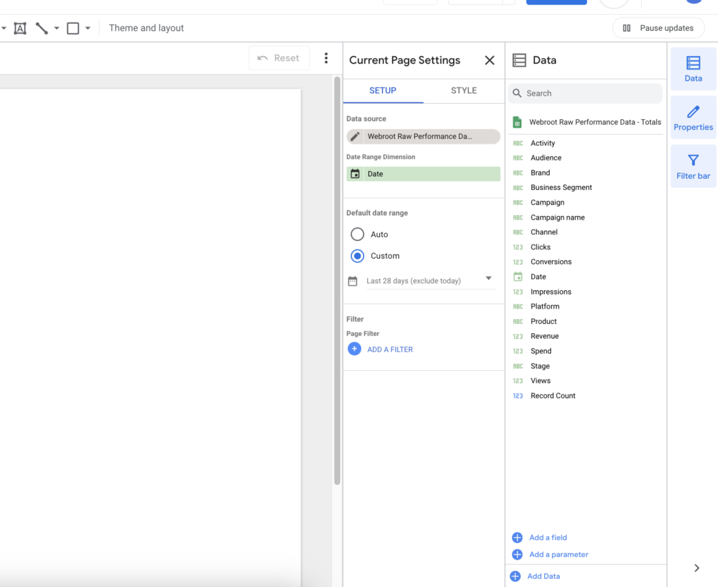
Go to Page and then go to Current page settings
- Data source – Assing the same Google Sheet data source that we created above
- Date – Assing the Date field
- Default date range – Select Custom and set the date range to Last 28 days (exclude today)
Now that we have our page settings defined let’s go ahead and add scorecards.
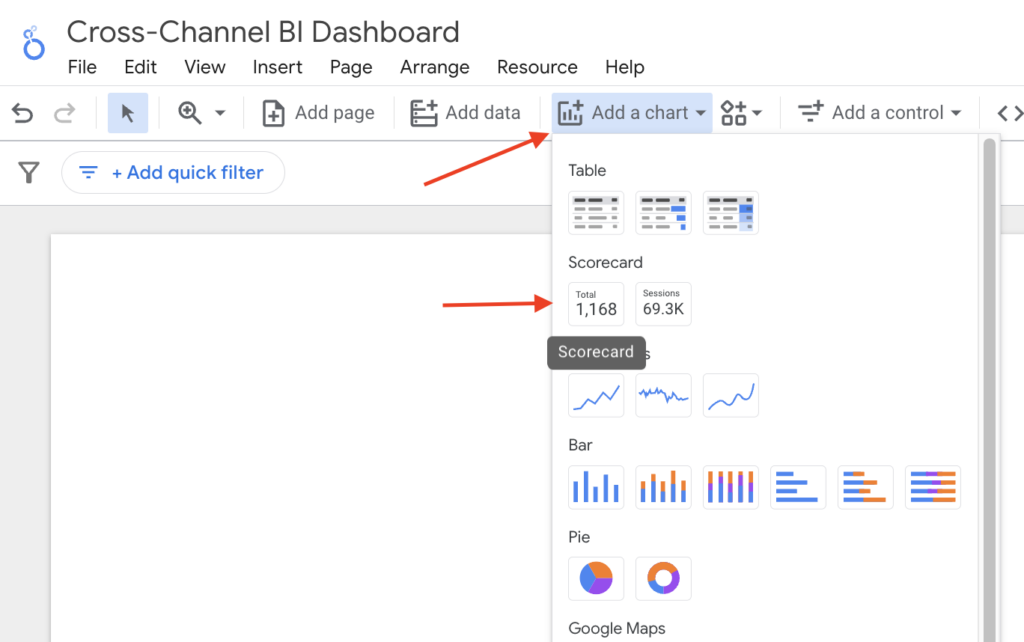
Adding Scorecards To Your Dashboard
First, we are going to want to add scorecards. Click on Add a chart and then add a scorecard
Select the scorecard and in the right-hand menu under Setup set the following:
- Date Range Dimension = Date
- Metric = Spend
- Default date range = Auto
- Comparison date range = Previous year

Next, select the Style tab and make the following adjustments.
Select Compact numbers under Primary Metric
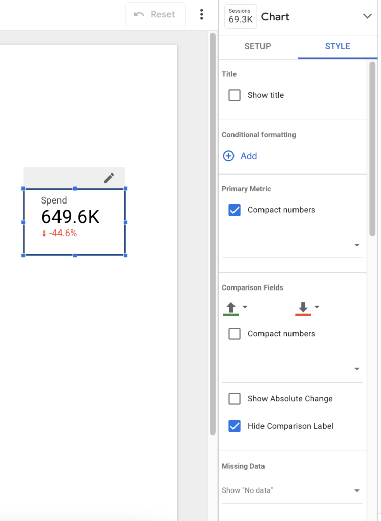
Depending on the Scorecard metric the Comparison Filed colors will need to be updated. For example when your CPA is down it should be green, not red. Since this example highlights Spend we will keep the colors as is.
Let’s also add a border to our Scorecard.

Once the Scorecard looks how you want it to you can duplicate it for all metrics. Since this is a performance dashboard our Scorecards focus on conversion metrics:
- Spend
- Impr.
- CPM
- Clicks
- CTR
- CPC
- Conversions
- CVR
- CPA
- Revenue
- ROAS
- AOV
The result looks like this. You can also refernce the Looker Studio Dashboard here.

Adding Charts To Your Dashboard
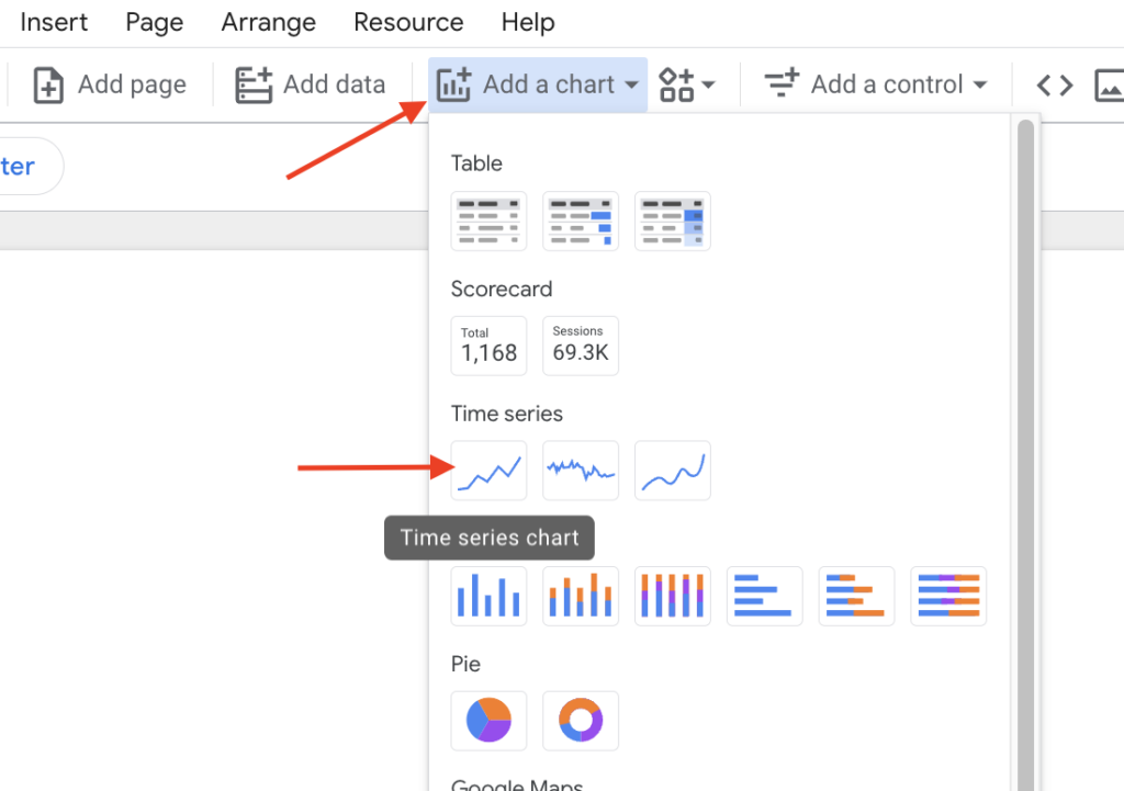
Now let’s add our charts for each one of the metrics in the Scorecards we created above. For this, we are going to add the Time series chart.
Click on Add a chart and then add a Time Series
Select the scorecard and in the right-hand menu under Setup set the following:
- Date Range Dimension = Date
- Dimension = Date
- Metric = Spend
- Default date range = Auto
- Comparison date range = Previous year
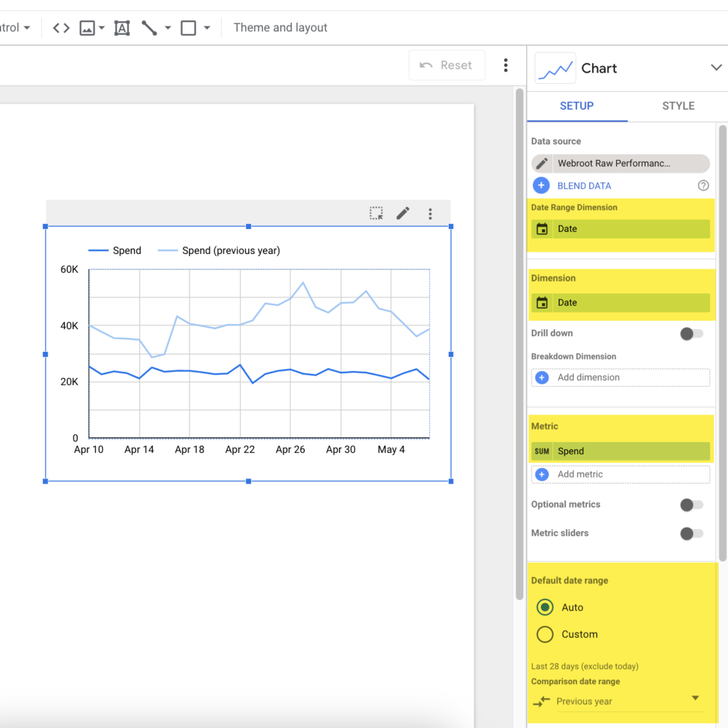
Next, select the Style tab and make any visual adjustments to the chart and series to match your dashboard theme.
Adding a moving average trendline is also helpful in understanding performance trends outside of anomaly days. In this example, I changed the Moving average Trendline to orange so that it is easier to read.

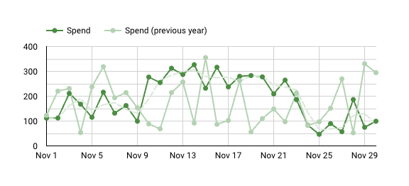
Now you can duplicate your time series chart and create one for each of the following:
- Spend
- Revenue
- Conversions
- CVR
- CPA
- AOV
- ROAS
The result looks like this:
Adding Report-Level Filter Controls To Your Dashboard
The above view is a great way to get a birds eye view of how performance is trending across channels. However, the nuances of what is a positive or negative driver are found on the channel and platform level. Lets add some filter controls so that you can dive into specifics when looking at these charts.
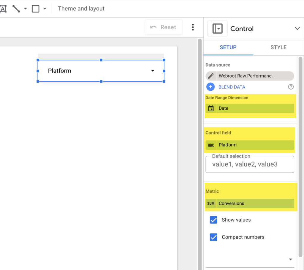
To do this click on Add a control in the top navigation and select Drop-down list.
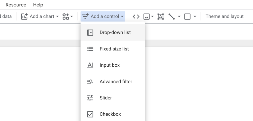
Under Setup in the right-hand menu set the Date range dimension, select the Control field, and set the Metric to Conversion and set the Control field to Platform.
We are going to add the following controls:
- Stage
- Platform
- Type
- Channel
- Country
- Region
- Campaign
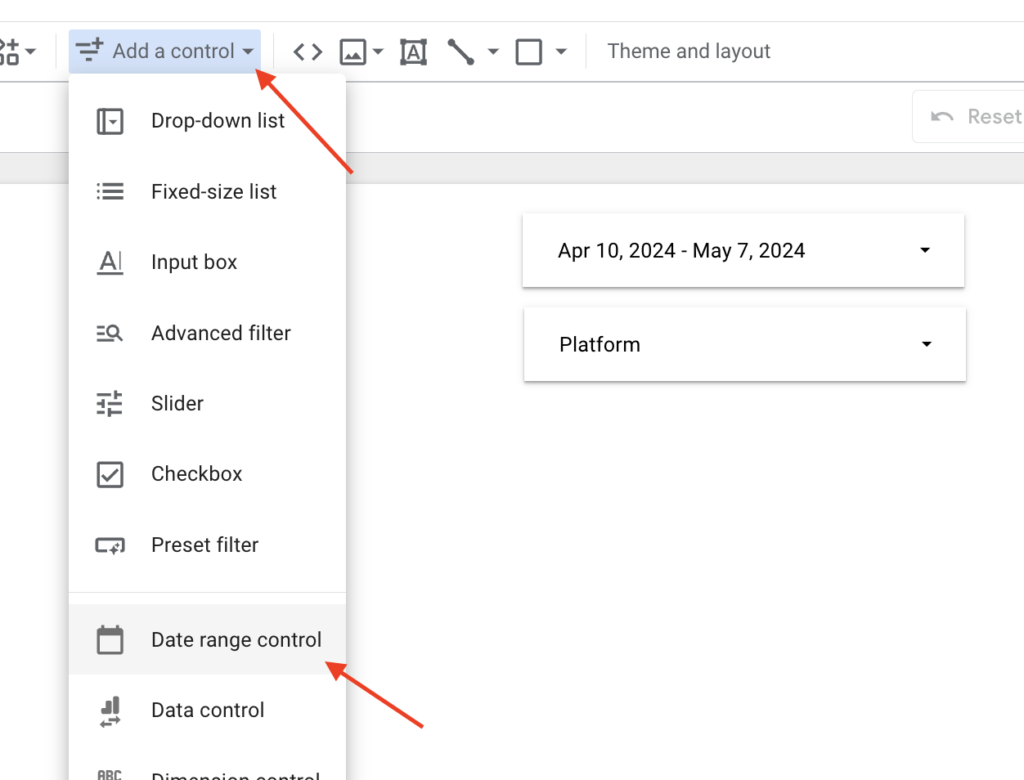
Having a Date range control is also helpful so that you can modify the timelines to look at specific campaigns or seasonal moments. To add a date filter click on Add a control in the top navigation and select Date range control.
Here is what the end results looks like. You can access the final scorecard and time series dashboards here.
Looker Studio Scorecard Dashboard

Looker Studio Time Series Dashboard
Conclusion
Building a cross-channel data warehouse with Google Sheets and Looker Studio might seem daunting at first, but with the right tools and a step-by-step approach, it becomes a manageable and rewarding task. By following the process outlined in this post, you’ll have a solid foundation for measuring, analyzing, and optimizing your marketing performance across multiple channels.
Remember, the key to a successful dashboard is consistency in your data and naming conventions, regular updates, and clear, actionable insights. With your data now unified and automated, you can focus on what really matters—making informed decisions that drive business outcomes.
If you have any questions or need further assistance with building your dashboard, don’t hesitate to reach out. Whether you’re looking for help with setup, customization, or advanced analytics, I’m here to support you. Feel free to contact me for any dashboarding support you might need.
AUTHOR BIO:

With over a decade of digital marketing experience, Gabe excels in search, display, and social advertising across various industries. He specializes in performance media and data-driven storytelling, building custom digital ecosystems that enhance user experiences across both paid and owned channels. Connect with Gabe on LinkedIn or explore more of his articles here.
Leave a comment